
Day 0020
/The grapes again, from a different angle. It’s kind of a cool look. I may want to do a more finished piece along these lines.
The grapes again, from a different angle. It’s kind of a cool look. I may want to do a more finished piece along these lines.

More of the skeleton cast. I had the idea to put a bunch of artificial grapes that I have around its head as a sort of Bacchus reference. That’s the sort of thing us arty academic types like doing. Usually, some meaning would be implied but in this case it was just that I wanted to add some other colors to the scene and add some complexity to force myself to get to the point through forcing velocity on myself. Those grapes are a lot of fun. They’re sort of antique, too. Wire, bendable stems, but the leaves are some sort of cloth and the grapes are painted wood.
If you’d like to interpret this as a memento mori with a vinous theme, be my guest, but I swear it was just something I thought might look cool. I was right, too.

Another skull. Jaw too big, darnit.

The skull again. This time, it’s wearing an antique fencing mask, with chipping leather padding around the head. Besides looking cool, the thing adds a level of visual “fog” to the skull, with nearer surfaces showing more clearly througb the mesh than further. Also, the highlights on the metal mesh add an interesting dimensionality in themsleves. And, of course, the mesh is waaaaay too fine to paint except in general terms. Difficult is the point. Someday I’ll get confident enough to try a half-hour nude or portrait again.

Starting a series of skull paintings. Just for fun and so I think less about what I’m going to paint. Just setting a theme is easier on the brain. This plastic skull cast is also a great chance to experiment with neutral colors, which i mix either out of blue and sienna or red and green. Both allow for fun leaning warm or cool, and the simple tones of the skull allow for a lot of attention to edge hardness or the lack thereof.

Kind of like day 14, only moreso. I think this one worked a little better. I got the angles of the abalone shell messed up on the last one, and had to just go with it. This time I made sure to get the oval sketched out quickly, so I was able to have more fun with the texture.

Deliberate difficulty. I’m getting too caught up in the details, so I chose to paint the blue bottle (problem level: reflections, perspective and intense color) and the abalone shell (problem level: iridescence). By choosing something that’s just impossible to paint in detail, I’m hoping to force myself to work on the big stuff.

Many years ago, my in-laws gave me a skull that they had found on a walk in a New Jersey park. It appears to be that of a chihuahua. It has the basic canine structure, but a huge forehead and some missing teeth, characteristic of the chihuahua.

From a photo reference of Costa Rica. I love the place, but I have the hardest time painting it. I don’t know exactly why, either. Maybe the complexity of the landscape, maybe the humidity of the air making the atmospheric perspective a thing to wonder at, maybe I’m just not able to be analytical enough. Whatever. I’m going to continue to try.

Jacobs Point, a small salt marsh between Bristol and Warren, RI, is sort of a muse to me. While I’ve been unfailthful to her on quite a few occasions, the basic forms that land, water, plants, and sky take there are endlessly interesting to me. I think there’s a few reasons for this, one of them being that having grown up in Manhattan, the idea of a horizontal landscape is alluring. The other, perhaps more important, is that they always mean a sort of freedom to me. I used to spend a large portion of my summers in a New Jersey salt marsh, now no longer in existence, where I got to experience being truly alone for the first time. It’s an experience that gets harder and harder to replicate as I get older, as I seem to require greater and greater mileage between me and the rest of humanity to feel the same way. I miss it terribly, but Jacobs Point is pretty wonderful.

An alternate view of the same spot. It’s really odd how you can be walking along, spot something, and go, “That would make a great painting”, and then walk three feet to the left and discover that it’s no longer a good painting. Some subjects, though, allow for a ton of different approaches.

A landscape! This is a view to one side of the bike path in Warren. Near the municipal park-n-ride, and almost exactly opposite the site where a transformer exploded last week and shut down electricity for almost the whole town. I’m still trying to resolve my approach to landscape. I strongly tend toward the idea that landscape is the land we see, or don’t see, around us, and not the dramatic, picturesque landscape of the classic rock formations, mountains, or lakes. The landscape we disregard. Or, in addition, the sorts of landscapes we’d hunt for frogs and insects and fungus in as kids. Or at least I would. This approach is part of the reason that i adore the work of Isaak Levitan. He was an early painter of the Russian landscape, during a period when artists were genuinely perplexed about whether it was possible to paint a Russian landscape at all, since there was nowhere that looked at all like the existing models of landscape painting, the Arcadias of France and the Romantic dramas of Germany. Russia was all enormous flatlands, with enormous skies and enormous stretches of birch and pine forest, interrupted by giant rivers from time to time. Levitan and some of his contemporary artists in the Peredvizhniki used this as the basis for creating what I think is among the finest visual poetry.

First post-cataract-surgery painting. I chose to paint a beetle because I couldn’t really see the detail of a beetle for the last few years. Now I can, and of course, the best thing to do painting-wise is to promptly disregard that by squinting and unfocusing my eyes. One of the paradoxes of painting stuff. On the whole, though, I’d rather see.

Mmmmmmm, mangoes. I love them. I love painting them, with their red, green, and yellow coloring and weirdly not-egg-shaped form, and I love eating them, especially the windfalls from giant mango trees. I need a few weeks/months/years in the tropics. This was another painting done on unprimed oil paper, and thus very absorbent. I did, however, give it a few licks of Neo Megilp, the Gamblin brand thixotropic alkyd that’s meant to imitate the effect of megilp, a very fun to paint with mixture of black oil (linseed oil boiled with litharge, or lead oxide….kids, don’t try this at home) and a hyper-concentrated formulation of mastic varnish. When mixed, it forms a jelly that’s a lot of fun to paint with. Neo Megilp isn’t as historical, but it’s also a lot of fun, and I’m guessing it’s less toxic.

A cowrie shell. Fun to paint, surprisingly hard to scan. It needed a ton of adjustment to even mildly resemble the painting. I think it’s because of the large number of warm and cool grays, and the fact that the image tilts so much to the lighter end. Cowries are a lot of fun to paint, with rich warm colors and cool highlights that really encourage a more planned way of painting—basic form, shading, then mottling and then finally highlights. I lost track on this one and just concentrated on edges, I was really interested in where, with the shifting tones of the shell, the shell value matched the value of the background board. I tried to represent that by losing the edge there. That’s something I always used to avoid, having a somewhat Medieval approach to painting, but now it’s one of my favorite things.

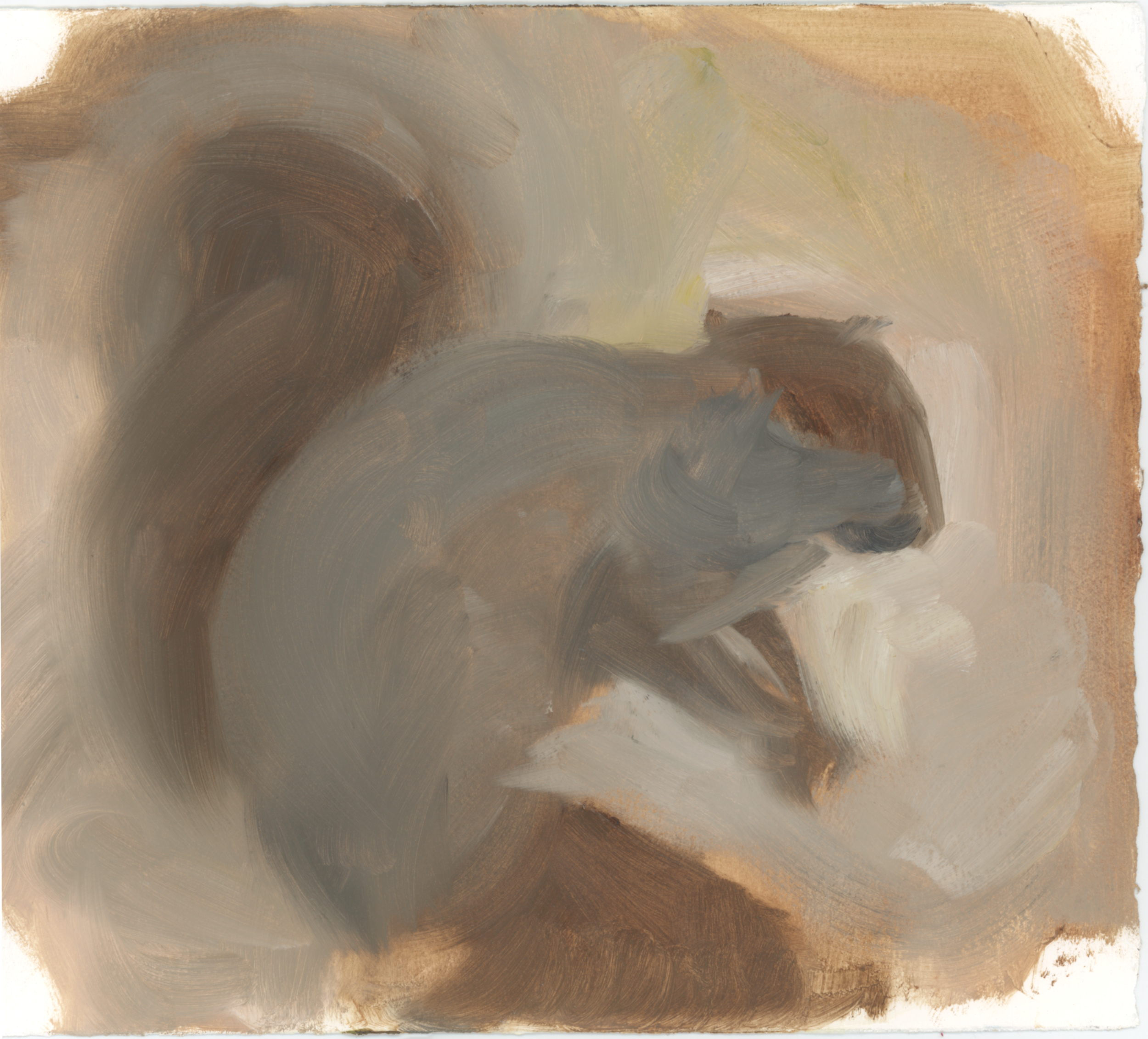
Some of you may remember my older painting blog, where I was perpetually having trouble painting this stuffed squirel. Ir’s tough because their bodies are shaped oddly, they’re covered with fur of all different tones of gray, and the edges of everything are so soft. This painting was done on oil-paper, which has an absorbent surface that requires a lot of scrubbing to get the colors to move. While a bit of a pain, now that it’s dry, I see that it actually worked really well to get that softness. Helped, I suppose, by the fact that my vision was so blurry I concentrated on the large forms. I’ll try to remember that now that I can at least partially see.
An apple. As always, a terrifying morass to paint, with a simple structure that reveals any deficiency in perception or representation of volume or form. Additionally, apples have a texture that incorporates streaks that follow the longitudinal lines of their structure, meaning you have to get the patterns right, as well. Finally, they shift between yellows, greens and reds in their larger markings, while maintaining the relative contrast in streak texture across the larger variations. The recipe, as such, is that you need to use the representation of a fine texture of streaks as displayed over a larger texture of mottling to describe a simple spheroid, and then apply appropriately chosen colors for the highlight over the inititial variations of light and shade on a sphere in order to finally capture the low polish of the texture of apple skin.

A pair of golden mangoes. I like the color yellow a lot, as it’s generally sunny and exciting, but without the freight of symbolism that red carries. Still, it’s a major pain to use it well. I use Cadmium Yellow Hue for my go-to yellow. The “hue” in the name just means that while it isn’t genuine cadmium yellow, the color in the tube has been formulated to behave as much like it as any non-metallic pigment can, that is, it’s (reasonably) opaque, intensely colored, and very warm. The hue colors are generally made from what are called synthetic organic pigments. These are bright, permanent colors that, while not having the opacity of metal pigments have the advantage of not losing so much chroma (color intensity) when mixed with other colors. In other words, the palest yellows, mixed with white, will still have a strong ‘yellowness’ about them, whereas with cadmiums, they get much duller. This can be a great asset when painting, provided you take it into account and make an effort to dull the color as I did here. Of course, you can dull yellow toward cooler or warmer, to vastly different effect, and that’s what I was trying to observe here. While my vision is pretty damn blurry, I seem to be able to pick up on warm and cool contrasts pretty well. The result of having a built-in neutral density filter? The result of doing this for forty years? Who knows.

These are exercises, limited to one half-hour start to finish, and done in oil. These first ones are on canvas board, but I have a big stash of Arches brand oil paper, a type of watercolor paper that resists the acid in linseed oil and is permanent when painted on with same. The paper is thinner, and easier to store, so I’ll be using that for a while. Until I run out, for sure, but I may just decide to stick with it. There’s a certain delightfully cruddy quality about painting in oil on paper. Oil has this reputation, at least for me, of historical preciousness, of a finicky requirement to work in a particular manner, in particular layers, Never mind that it’s simply the most fun painting medium out there. it has a psychological heft that can mess with your head, If you let it. The thing daily exercise painting lets me do is ignore the preciousness of oil and just use it as a tool.
This is a couple of bottles old enough to have become slightly translucent. Aside from the ovals of their bases and necks being an easy way to see if I’ve messed up the damn perspective, they’re a lot of fun to paint. My usual palette:
Gamblin Flake White Replacement
Utrecht Burnt Sienna
Any old brand of Ultramarine Blue
Utrecht Permanent Green Medium
Utrecht Cadmium Red Hue
Utrecht Cadmium Yellow Hue

To begin again.
A painting of an abalone shell. Chosen because the mother-of-pearl interior of an abalone is gorgeous, and slightly difficult to paint. Basically, the process involves getting your neutral colors correct (a violet-gray) and then pulling pure greens and reds out as the angles of the interior of the shell change. For a variety of reasons, I haven’t painted seriously in about a year. I could ascribe it to having cataracts, but it would be more accurate to say it’s purely due to the existence of the cataracts getting me to question myself and why I paint. Some discussions with a friend, and some reading of philosophy made me realize, “What difference does it make why I paint, as long as I paint?” So I’m painting. Feels better.

Nick Jainschigg is a teacher, painter, and illustrator.
My wife’s amazing blog. Seriously, check it out. Deus ex Monica
All artwork © Nicholas Jainschigg. Powered by Squarespace
All artwork © Nicholas Jainschigg. Powered by Squarespace